le cafe’
My Role:
Art Direction & Graphic Designer
About:
Le Cafe’ is a restaurant and catering business in Apollo, PA that serves elevated diner meals. I developed their new branding and menu to promote a renovation of their space. Below is the deck of logos proposed, and the final logo with menu and apparel.
Logo Development
A deck of logo designs was conceptualized based on the cafe’s needs and the sensibility of the brand. While I was developing these options, I kept in mind that they needed to be able to work for any application current or future that the brand wanted to use. The logo had to have a version that could embroider on a shirt or hat as well as for small print applications. This is best executed with a word mark version. I also wanted to create a more classic emblem version for instances where we had more negative space or had the opportunity to show a more complex logo. In the future they could need something more decorative like a catering van decal. So I wanted to create versatile and clean designs.
The Logo
After presenting the logos to the client we decided to take two of the logo options and combine styles. We also added a secondary tan color and iconography.
Look & Feel
Uniform / Swag
The emblem logo can be used tonally to give some visual interest to the apparel, and the wordmark of the logo works better technically for embroidery.
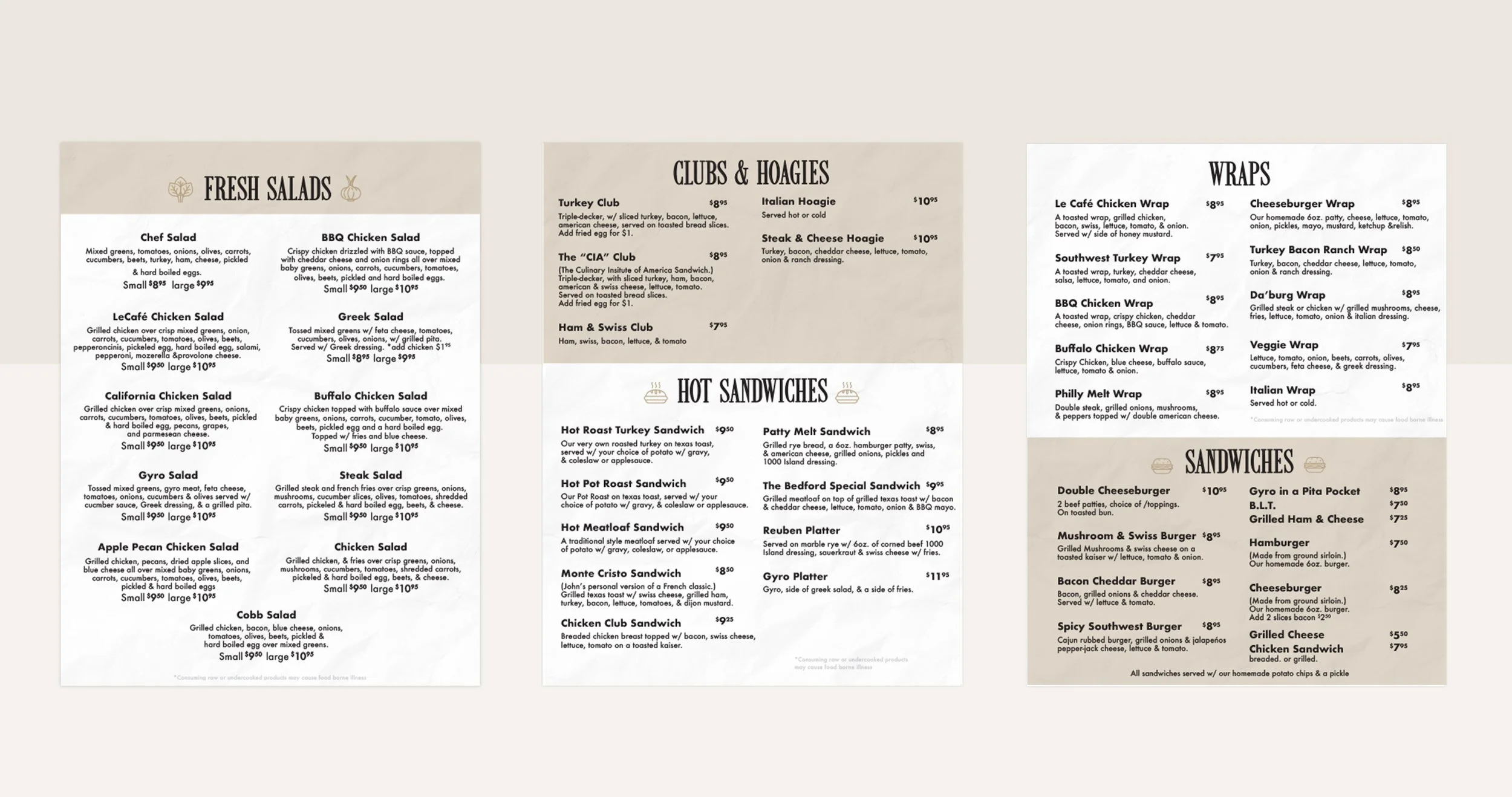
Menu
We got rid of the old menu with opaque images and opted for a more graphic solution- and less pages! This is was easier to print and read. The grid layout made it optimal for us to condense the menu as much as possible and keep prices transparent. Cents were shown as superscript to feel like costs were still affordable even with slight increases.


