
Stocked Up
My Role: Art Direction / Lead Designer
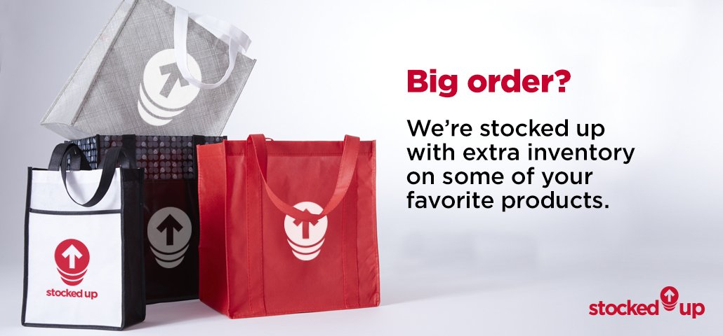
Creative Brief: Develop branding for specific items from the “Stocked Up” product line that qualify for deep inventory. Logo needs to be versatile to work for any product category or item. Icon can be used alone in small spaces to show deep inventory for product in catalogs and PDPs. Logo needs to work well with accompanying PCNA service logos and icons.
Deliverables: Logo, Look and Feel, Applications for each business unit, foundational social media graphics, banners, display ads, print callouts, etc.
Here’s a video I created of the final branding, below is the creative journey.
Logo Options


Final Logo
I wanted to create branding that could work in small spaces like an icon on a PDP, the full logo with the icon in a wordmark, and I also wanted the icon to use graphically when all I had was standard photography of product.
Original Look and Feel

This original color scheme and graphics were based on the PCNA secondary and primary colors. For the internal brands (Trimark, Leeds, Bullet) the logo and icon would use that brand’s colors.
Branding for Internal Brands


Little did we know that 2020 would bring more inventory challenges. Also in the midst of a rebrand, we updated the color palette - but kept the original logo/icon.


Social Media


